Adri Ustick
Strategic graphic designer with four years of experience helping teams creatively achieve their goals.

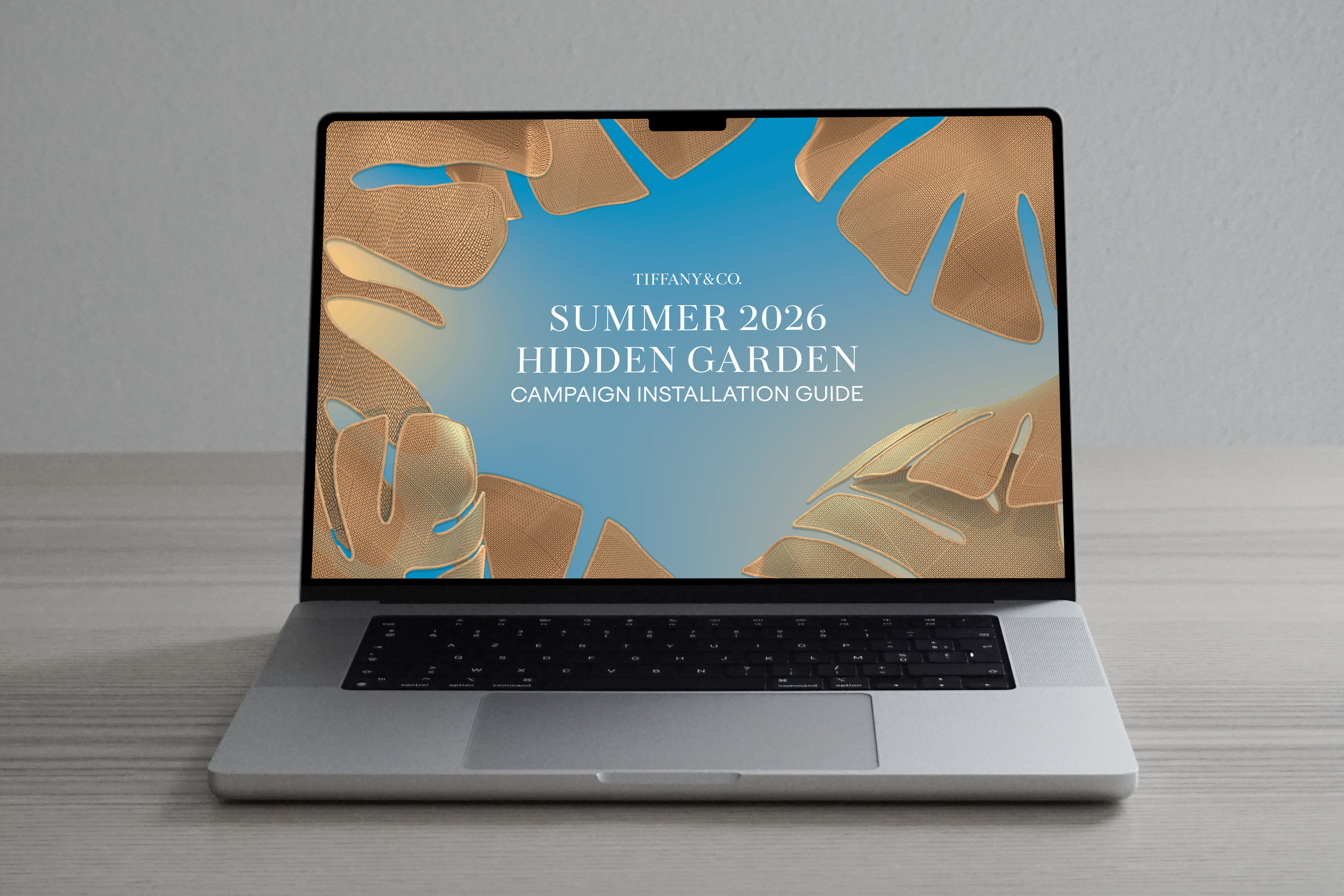
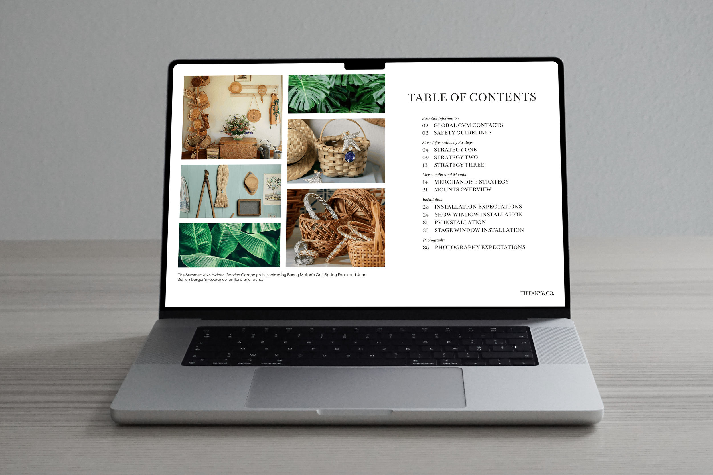
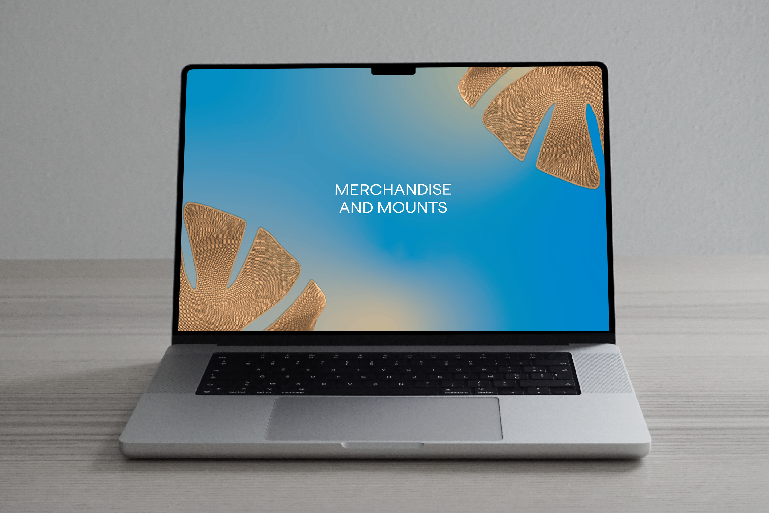
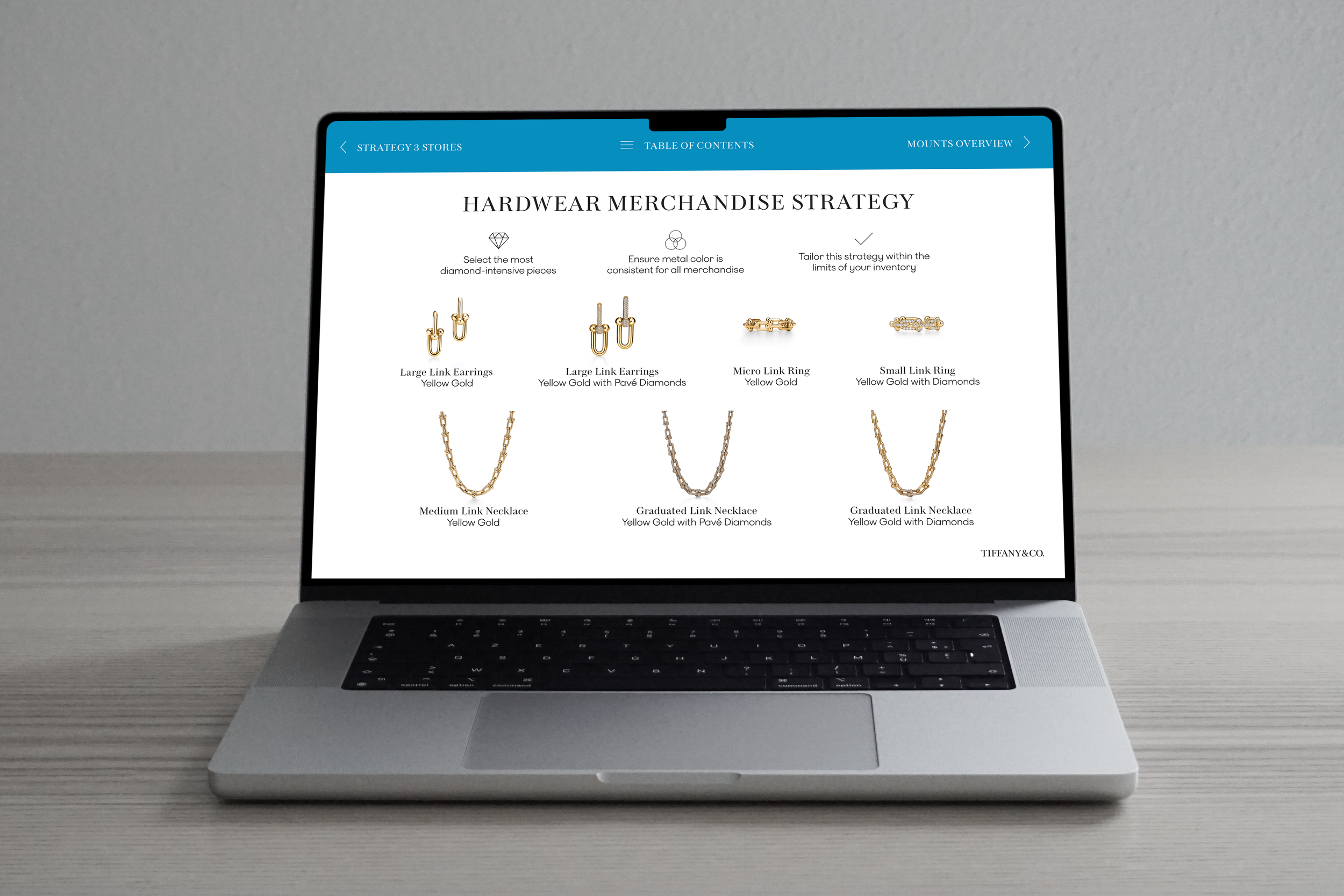
Tiffany & Co. Campaign Installation Guide
PROGRAM: InDesign
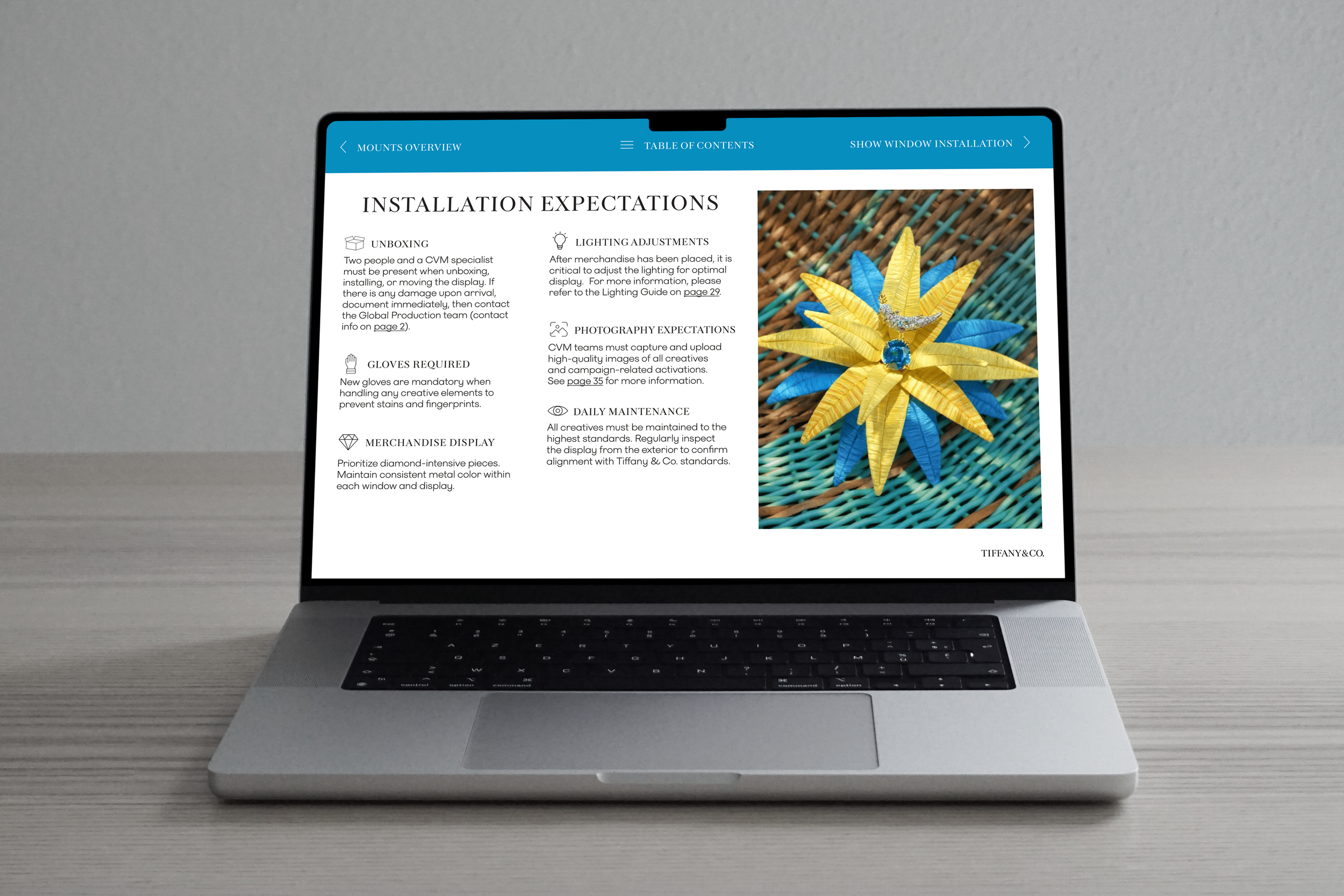
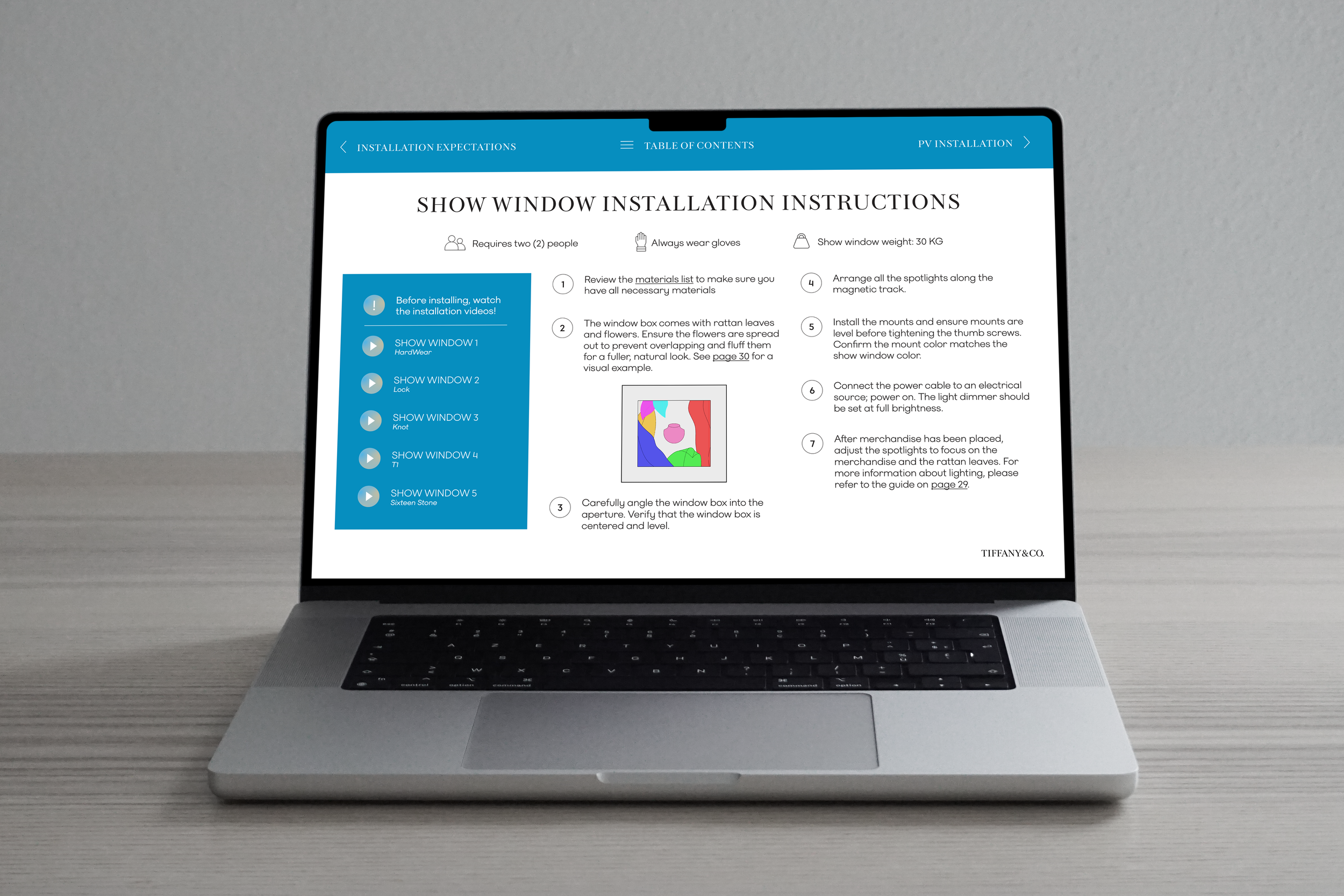
BRIEF: Tiffany & Co. launches six annual campaigns: Lunar New Year, Ramadan, Spring, Summer, and Holiday. With each campaign comes a new creative direction and unique installation requirements. To help retail teams bring a campaign to life, global markets require a clear, concise guide covering installation, merchandise placement, lighting adjustments, display maintenance, and more. The objective is to turn technical information into an intuitive, visual resource that any retail employee can understand, so every campaign looks beautifully uniform across the globe.
OUTCOME: For this interactive guide, user experience was top priority. Concise copy, visuals, white space, and easy navigation make every detail digestible. A simple layout leads the eye exactly where it needs to go, and links at the top of every page make navigation a breeze. Finally, the campaign’s unique theme is reflected, extending the creative direction into the installation experience.
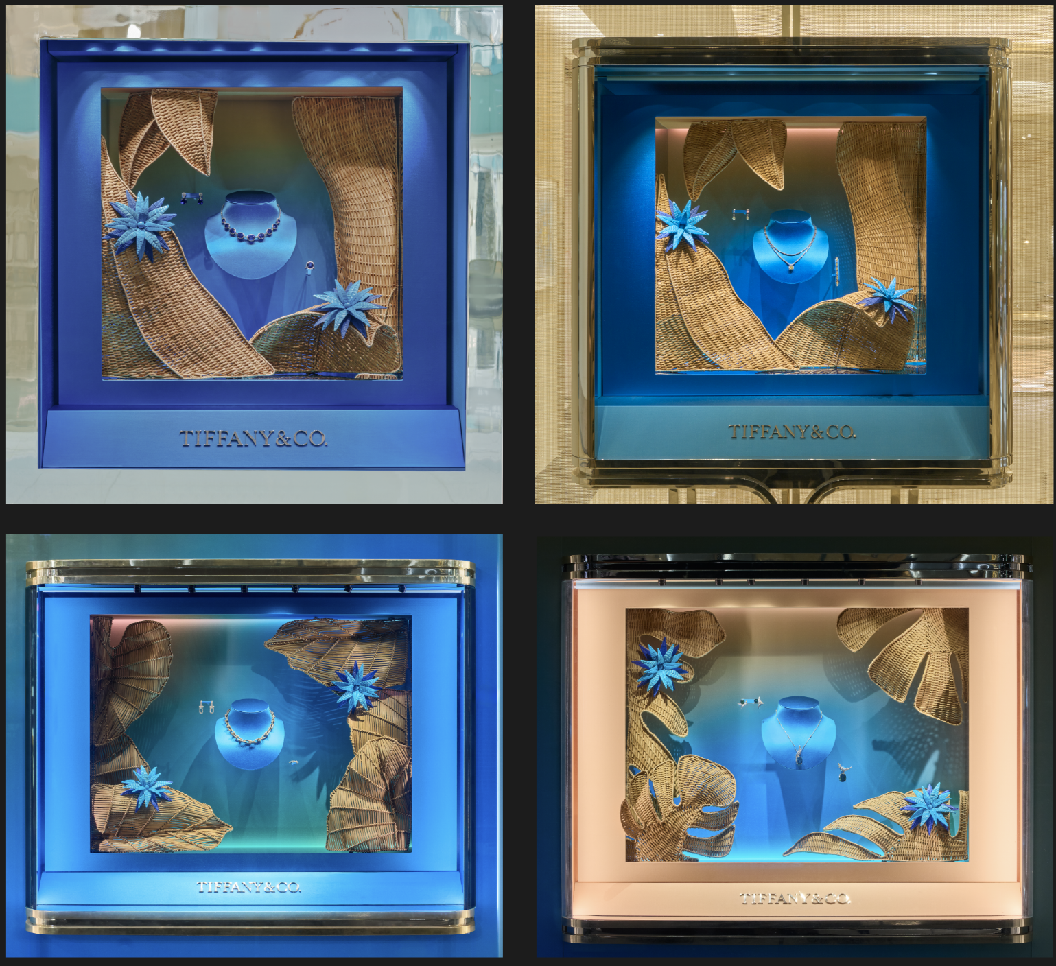
Shown below is a consolidated version alongside professional photographs of the stores’ show windows. These photographs – captured at the end of each installation – demonstrates the importance of these guides, ensuring each creative achieves its intended visual impact.
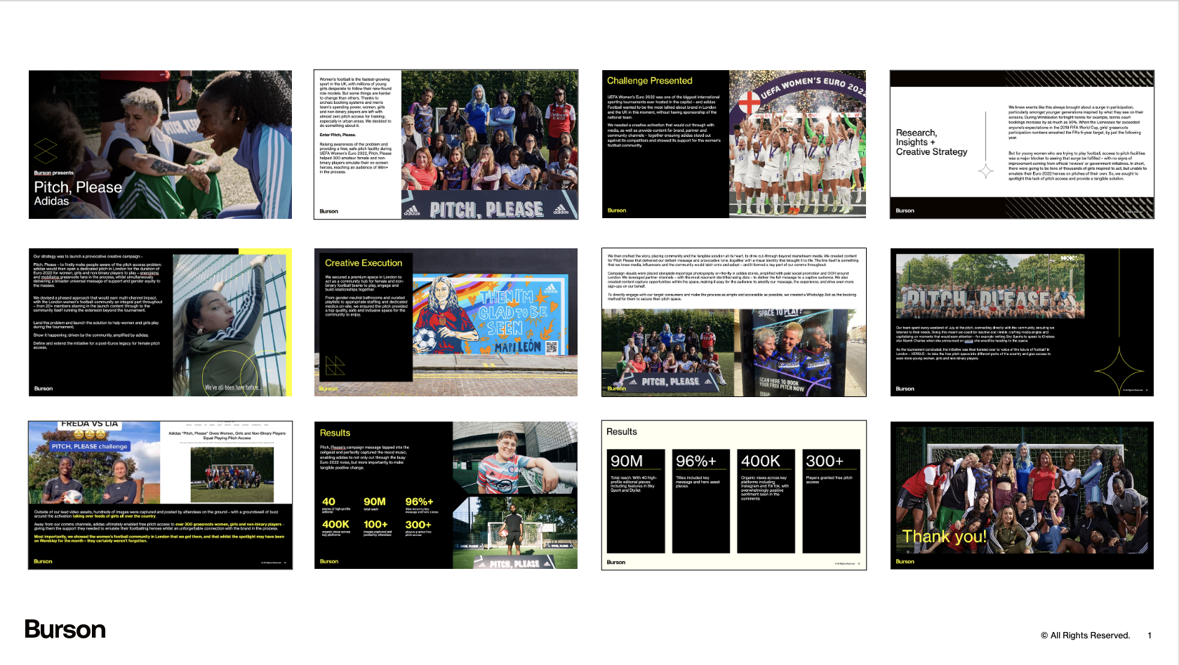
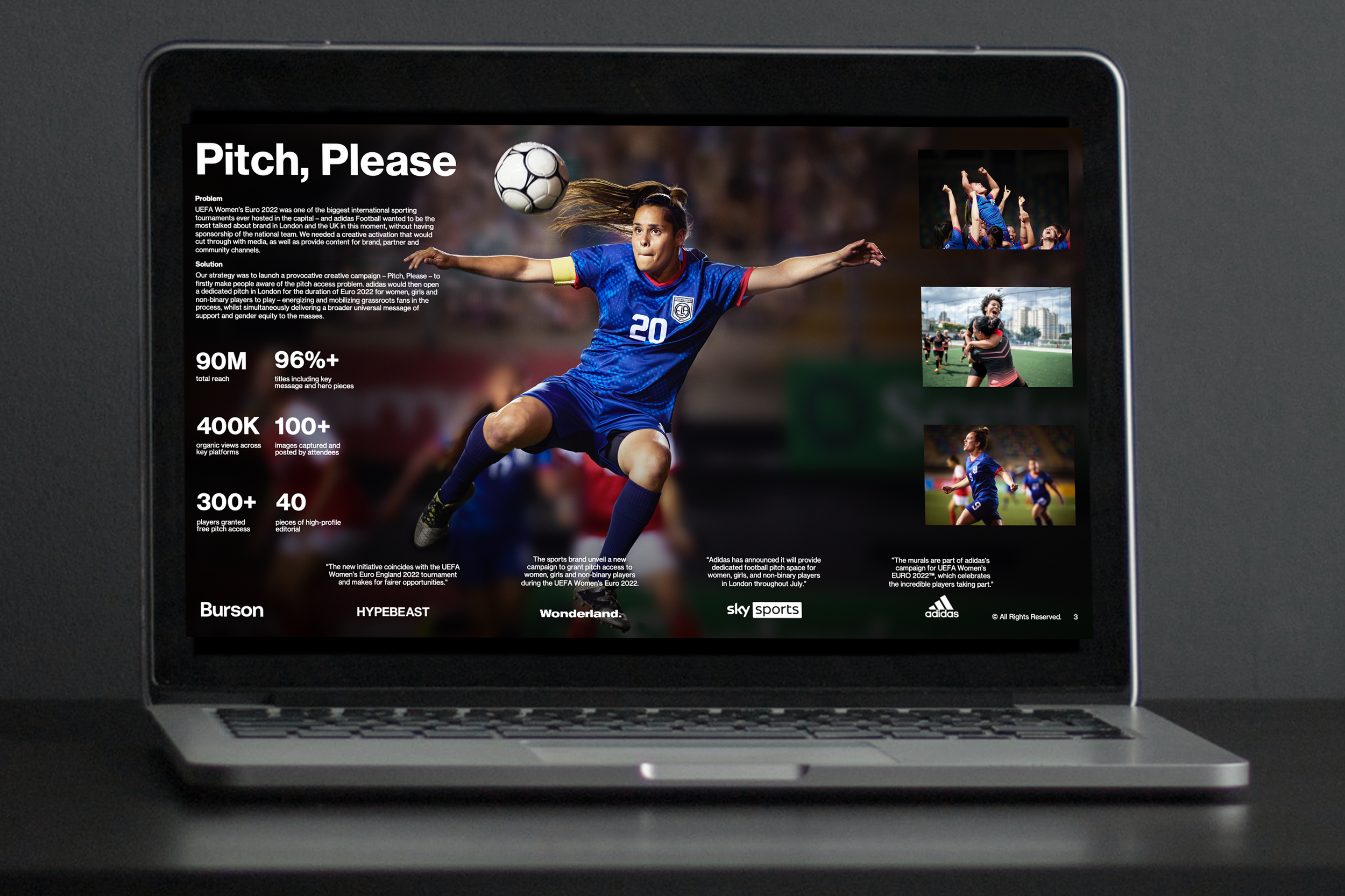
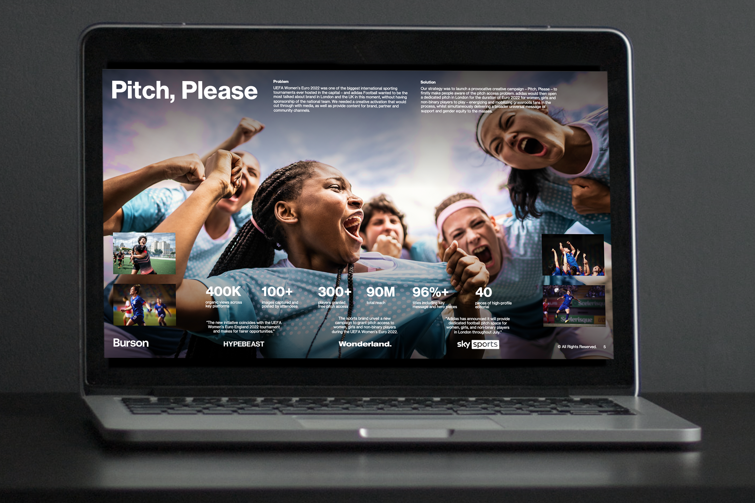
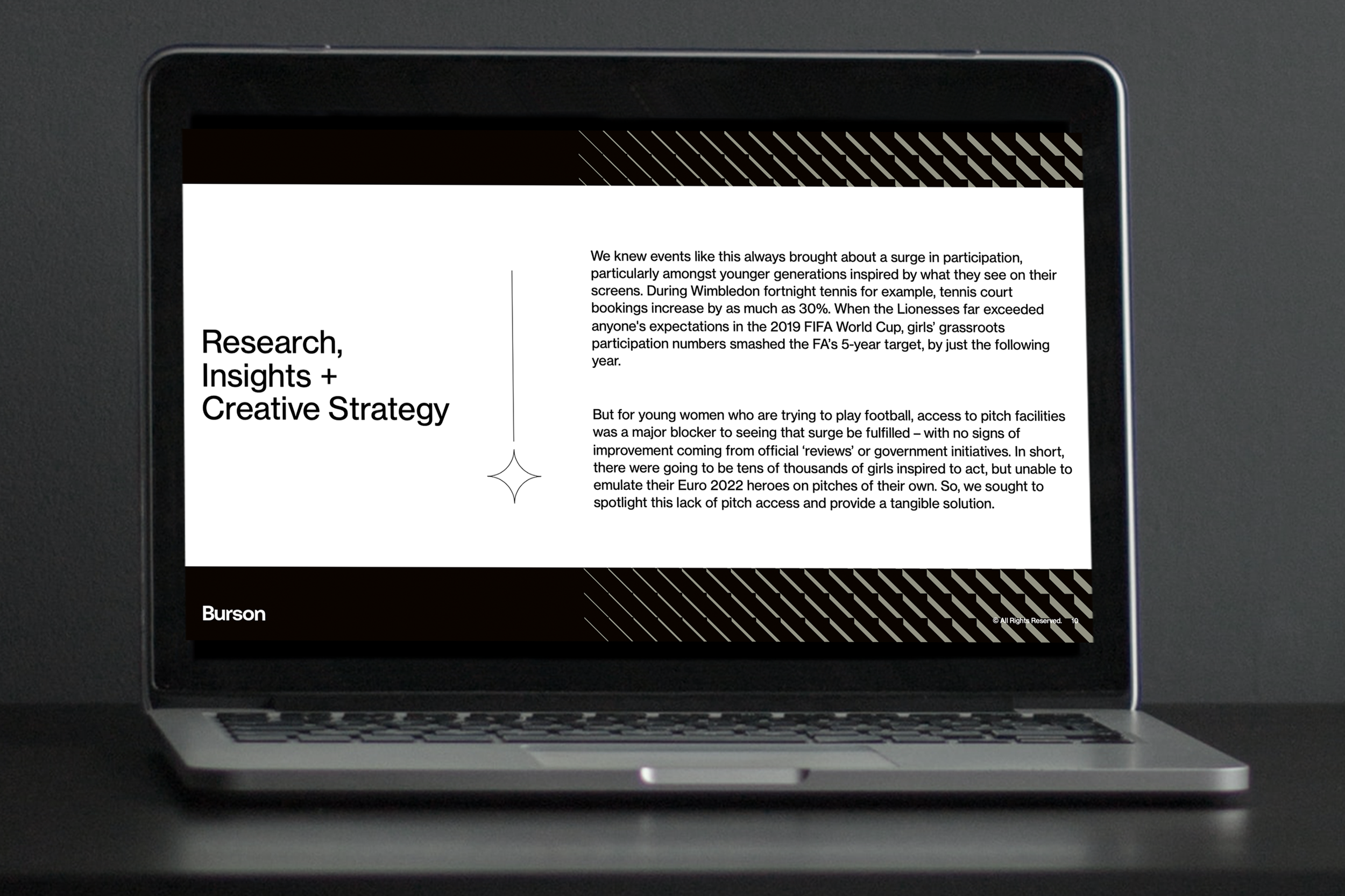
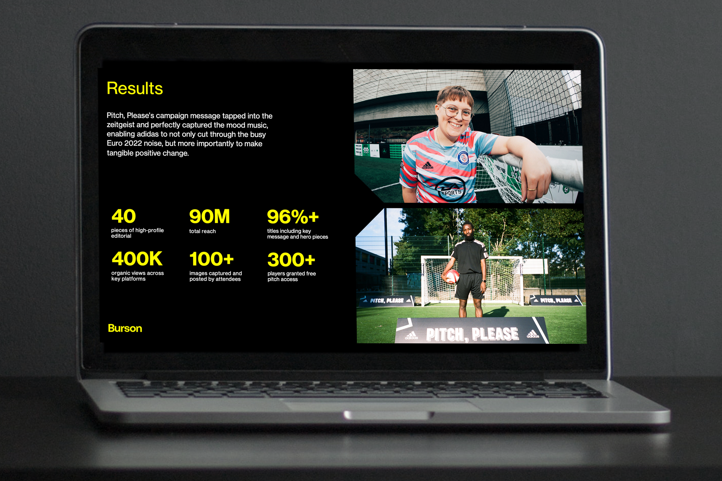
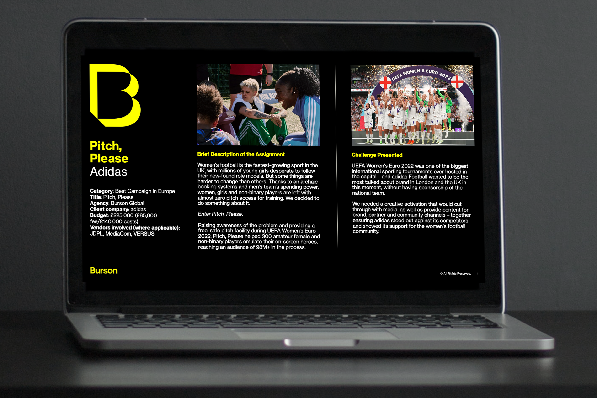
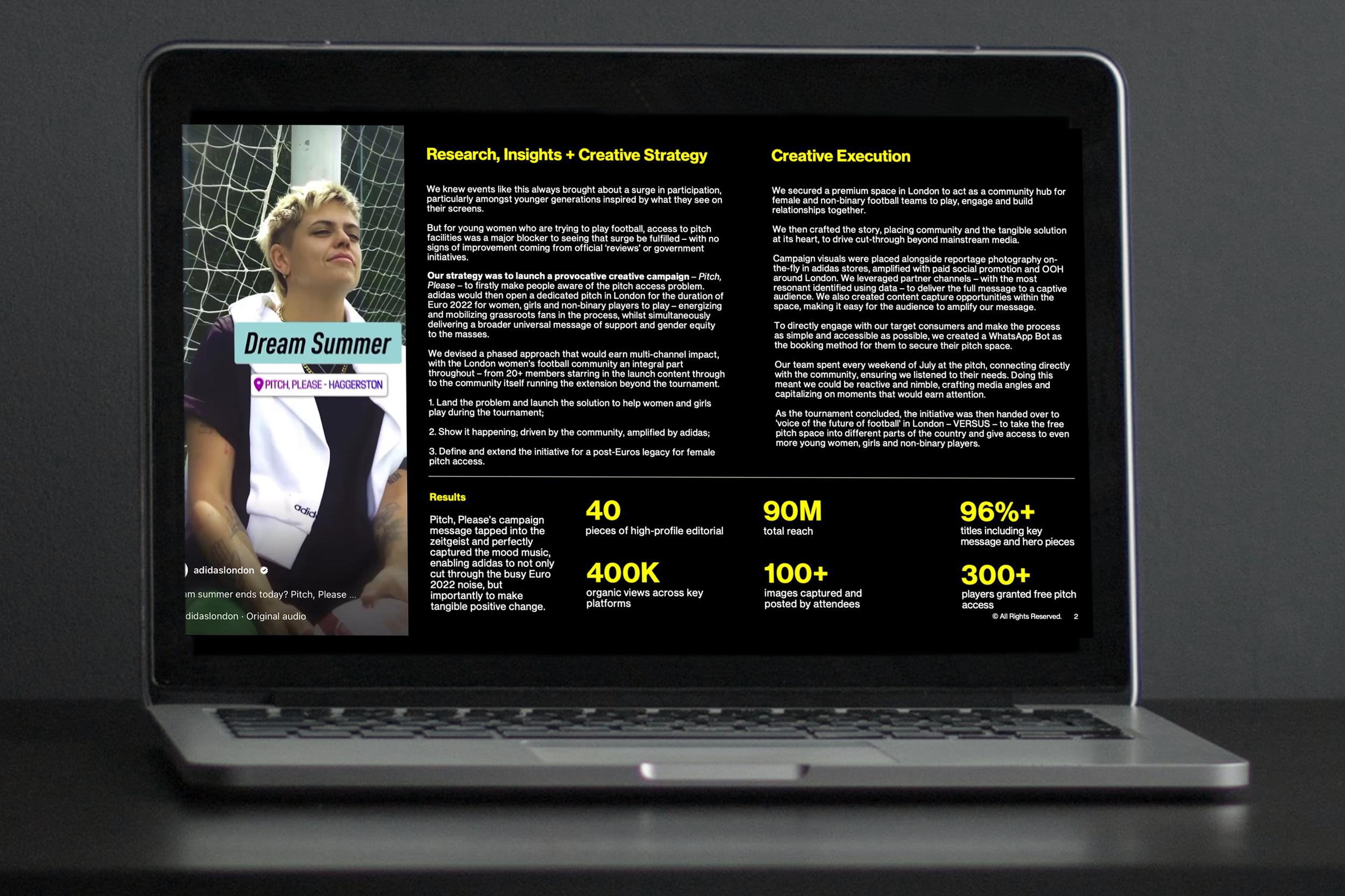
Burson Pitch and Awards Deck Template
PROGRAM: Microsoft Powerpoint
BRIEF: Burson, a global communications agency, needed a pitch and award deck template for their non-design teams to use. It was important that the deck template focused on a visual aesthetic while having ample space for word-heavy material.
OUTCOME: Non-design teams were empowered with visually-impactful PowerPoint templates so they could effortlessly populate decks independently.
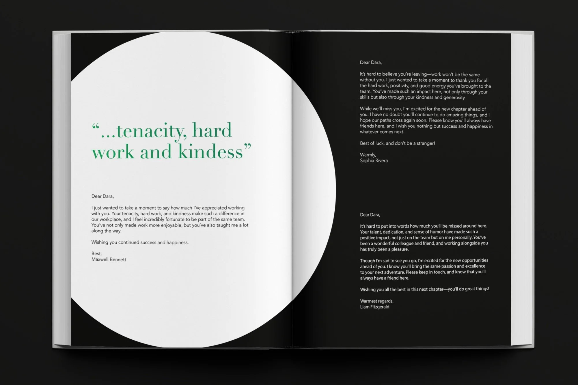
The Dara Book
PROGRAM: Adobe InDesign and Illustrator
BRIEF: The former CEO of BCW Global announced her retirement, marking the end of an influential chapter in the company’s history. Nearly 100 heartfelt email responses poured in from her colleagues, friends, and collaborators, each sharing personal memories, gratitude, and admiration. To honor her impact, BCW planned a surprise farewell gift featuring these messages. The task was to transform these notes into a beautifully designed book — elevated and personal while remaining true to BCW’s brand identity.
OUTCOME: The messages were transformed into a thoughtfully designed, coffee table-style book that brought each sentiment to life through a cohesive visual experience. BCW's CEO was able to take home this keepsake celebrating her time at the company — a period she can fondly look back on for years to come.
*Names and messages have been changed for privacy.


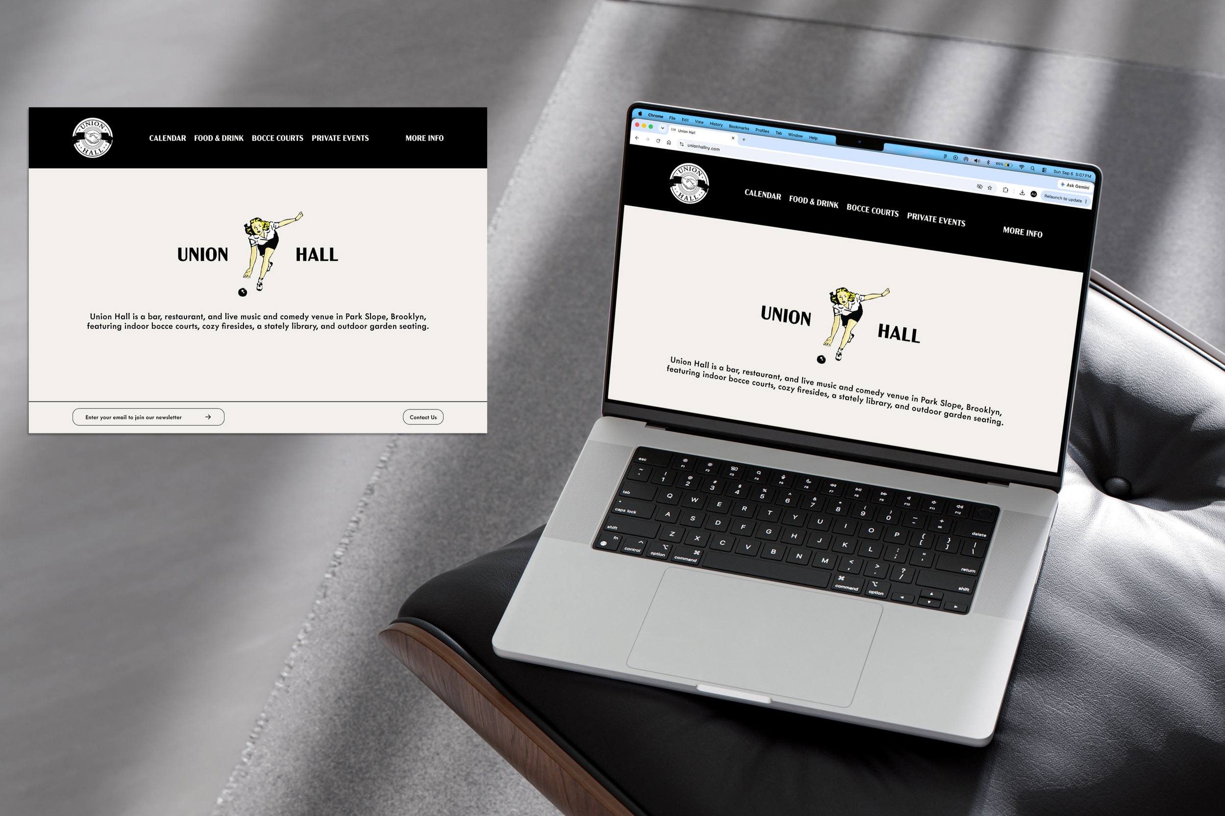
Union Hall Rebranding
PROGRAM: Figma and Adobe Illustrator
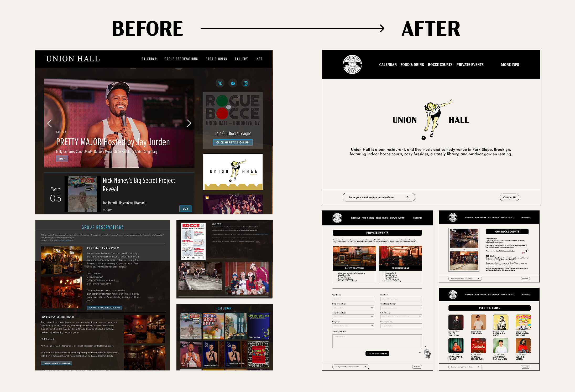
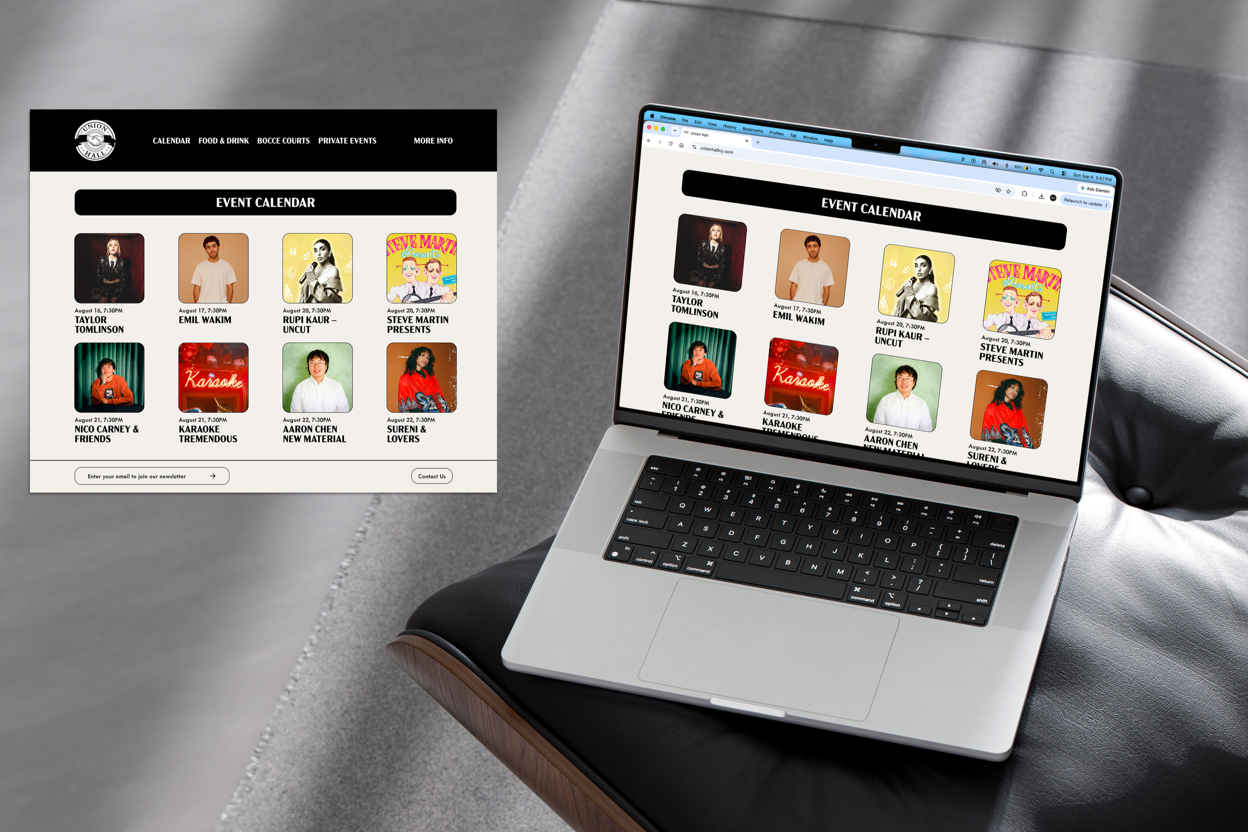
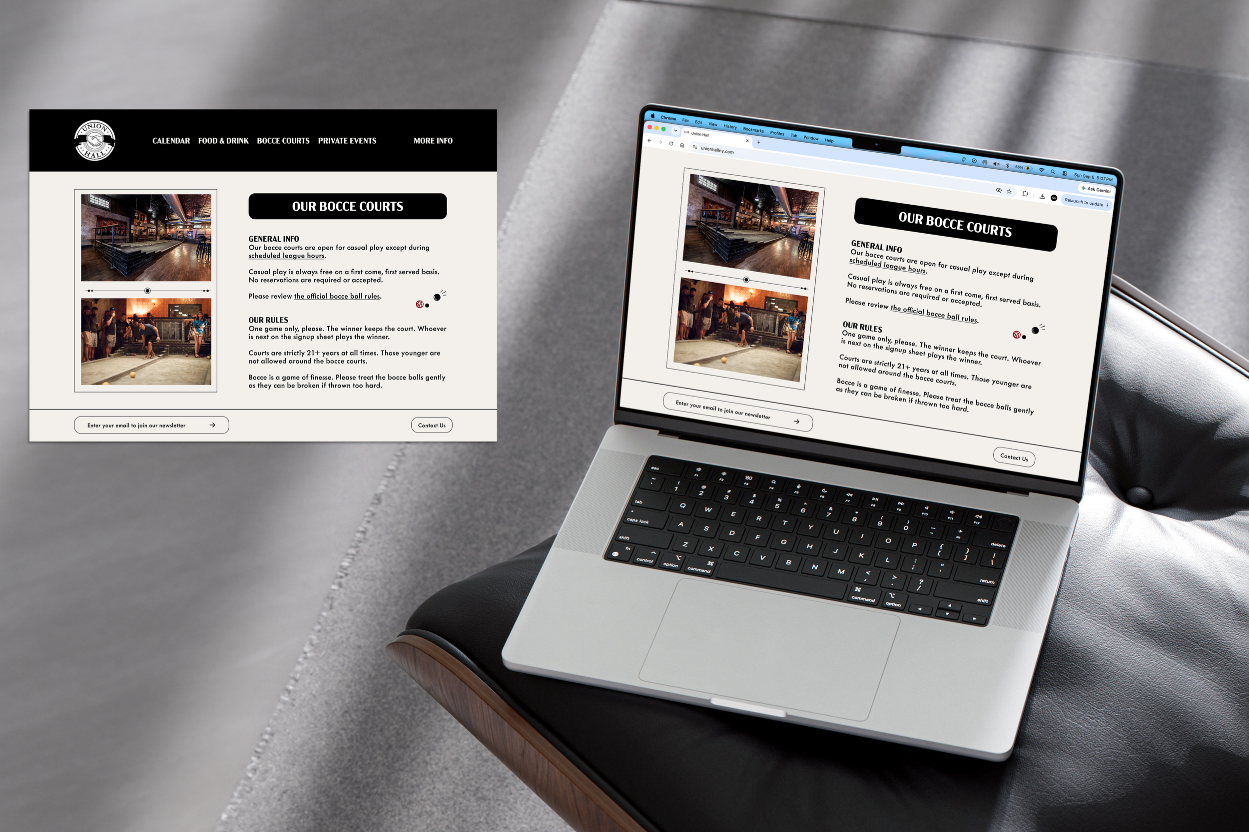
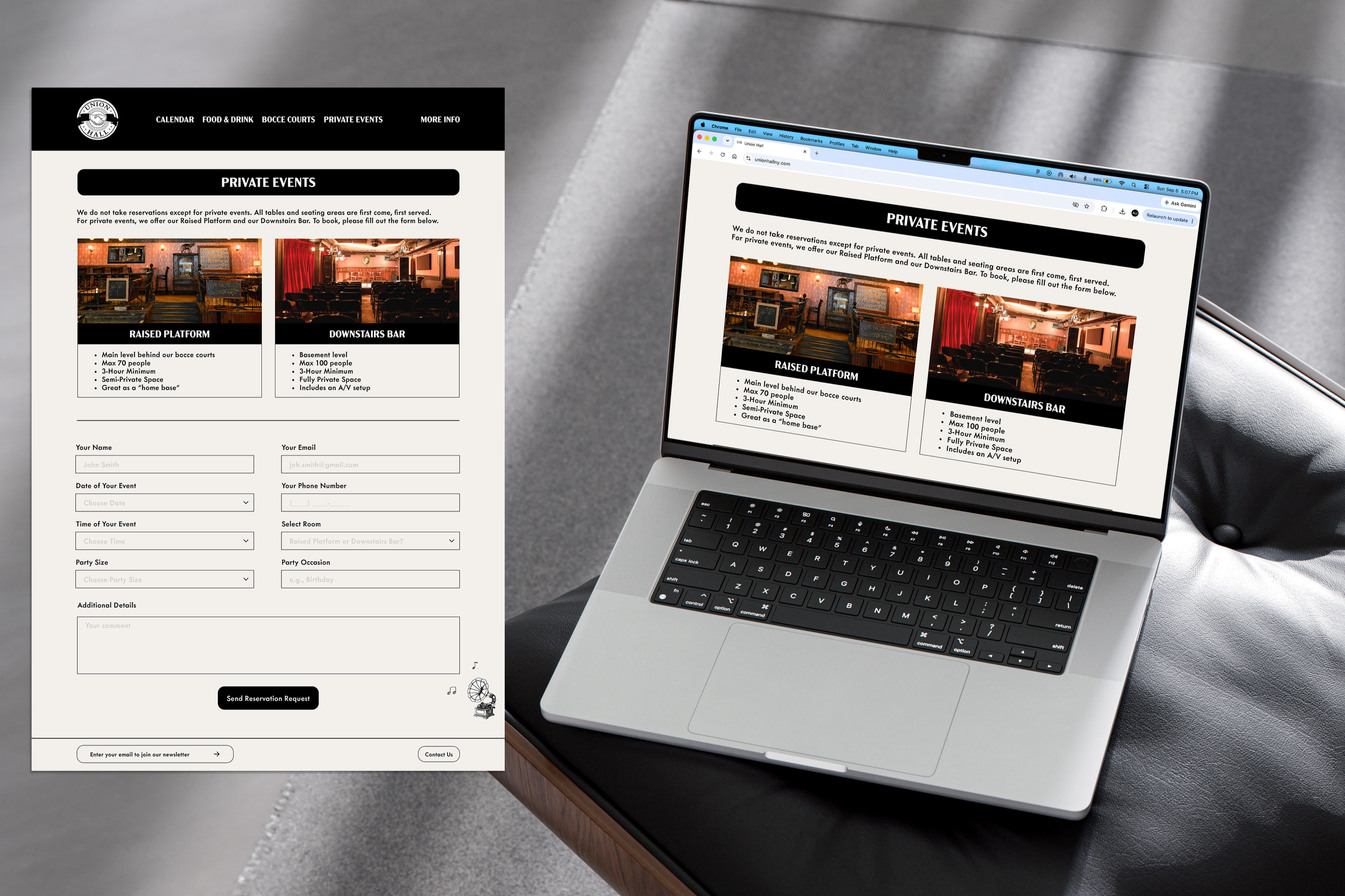
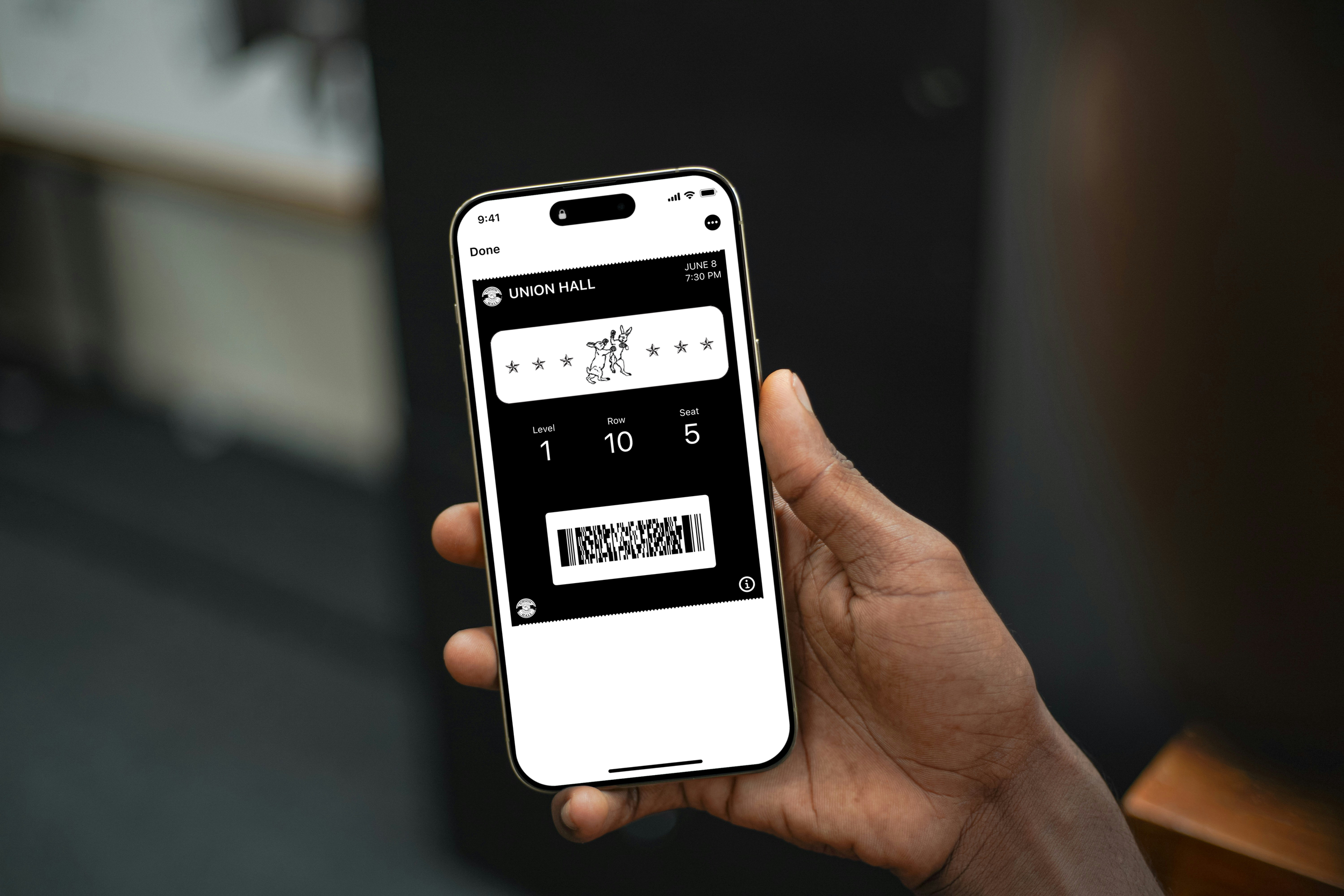
BRIEF: Union Hall – an iconic venue, bar, and restaurant in Brooklyn, NY – recently experienced declining audience turnout, ticket sales, and social media engagement. To address these challenges, the opportunity was identified to rebrand Union Hall with a modern but retro visual identity that would better engage its audience and reinvigorate the brand.
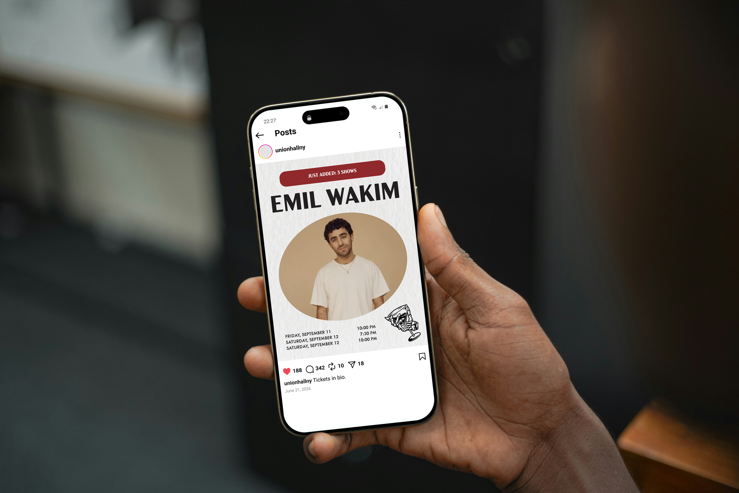
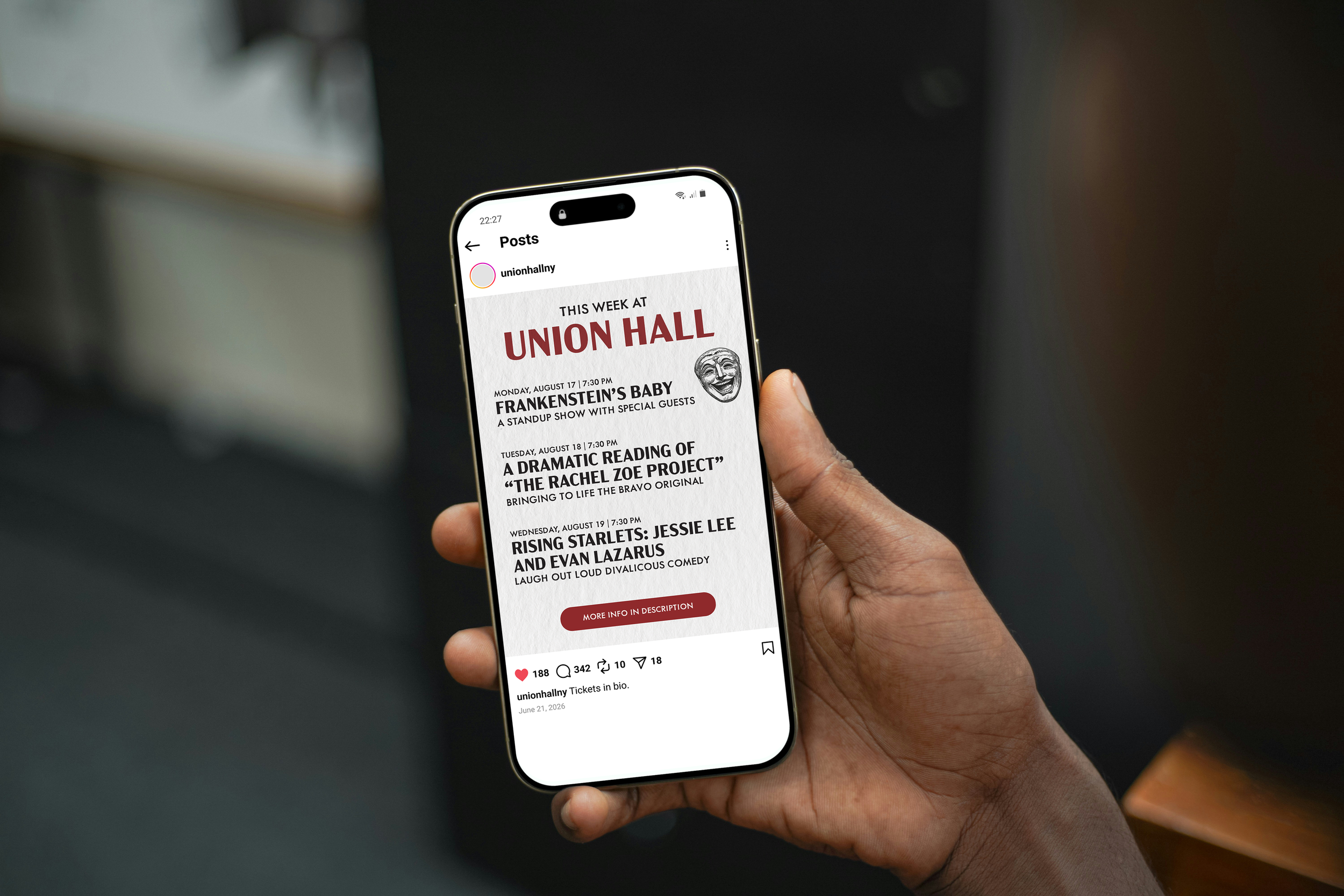
OUTCOME: The cleaner, more cohesive brand identity improved Union Hall’s audience engagement on their website and across social platforms. Additionally, redesigning their social media posts allowed for event information to be more digestible, helping drive ticket sales.
*Concept Work
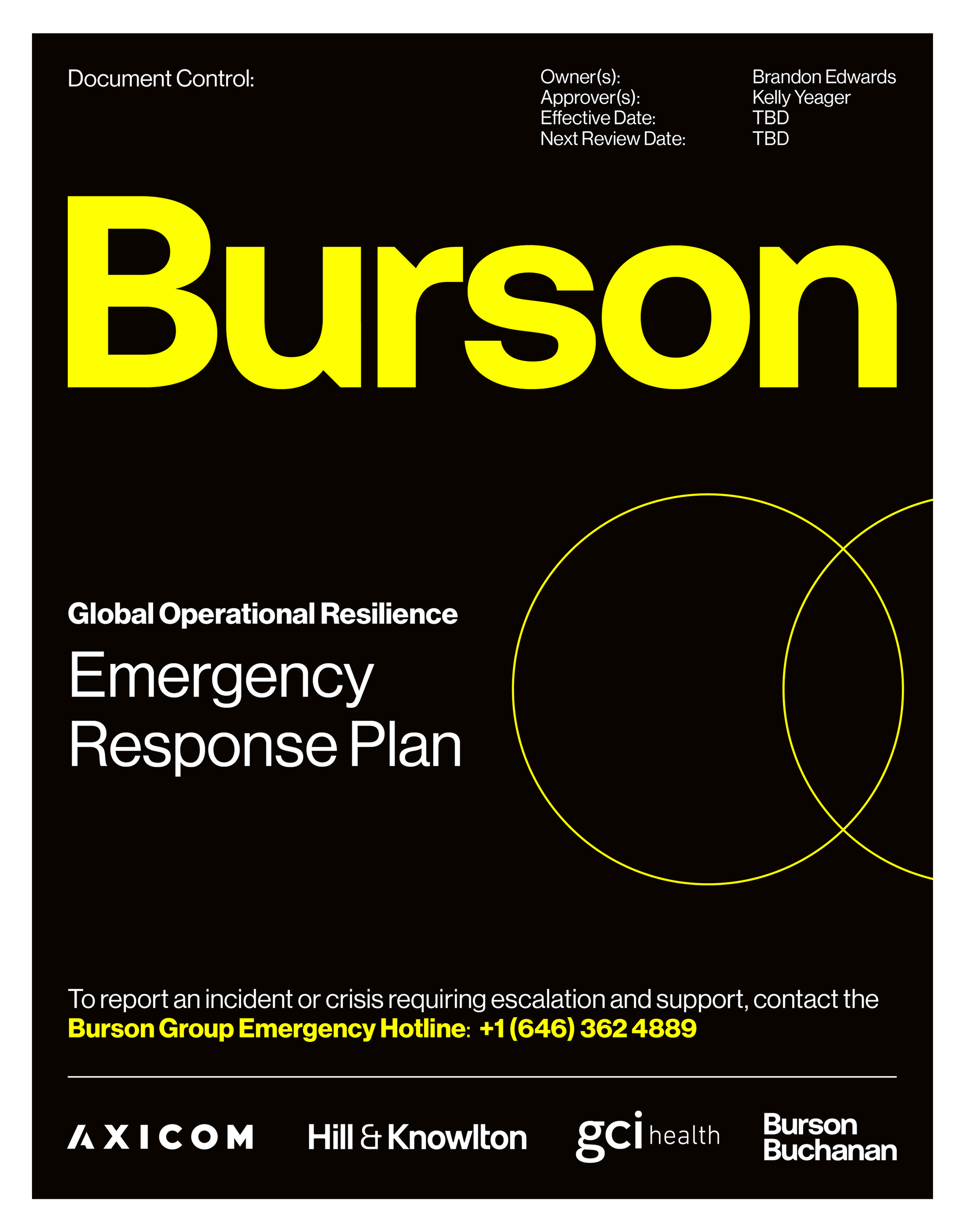
Burson Emergency Response Plan Book Cover
PROGRAM: Adobe Illustrator
BRIEF: Burson, a global PR agency, was in need of a refreshed cover for their Emergency Response Plan. The old design had a sterile, white background with red text.
OUTCOME: The cover of Burson’s Emergency Response Plan was updated to completely evoke the company's new brand identity.

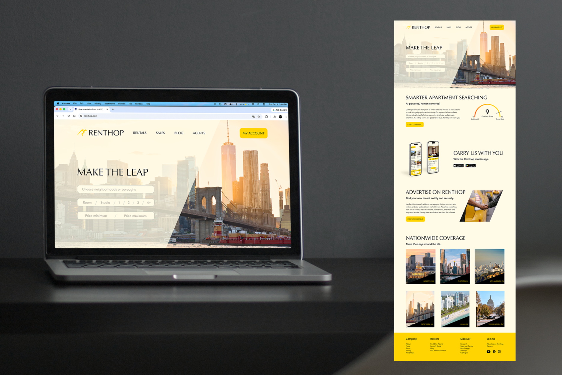
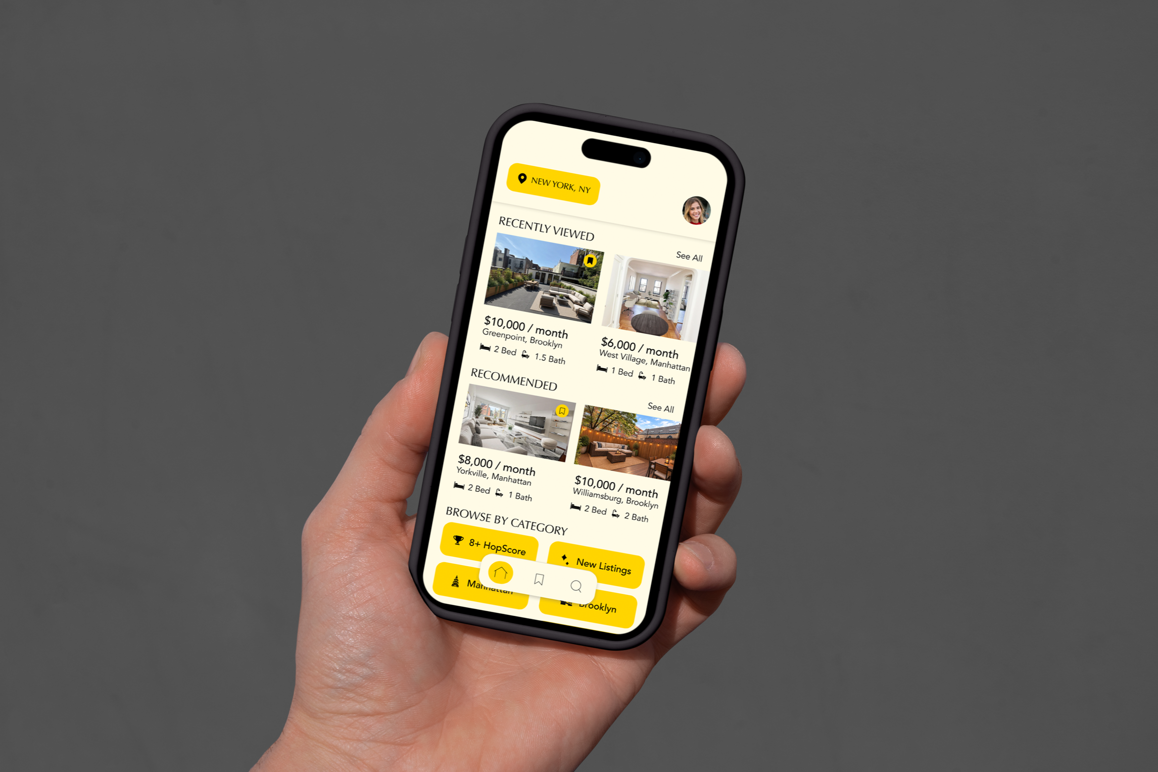
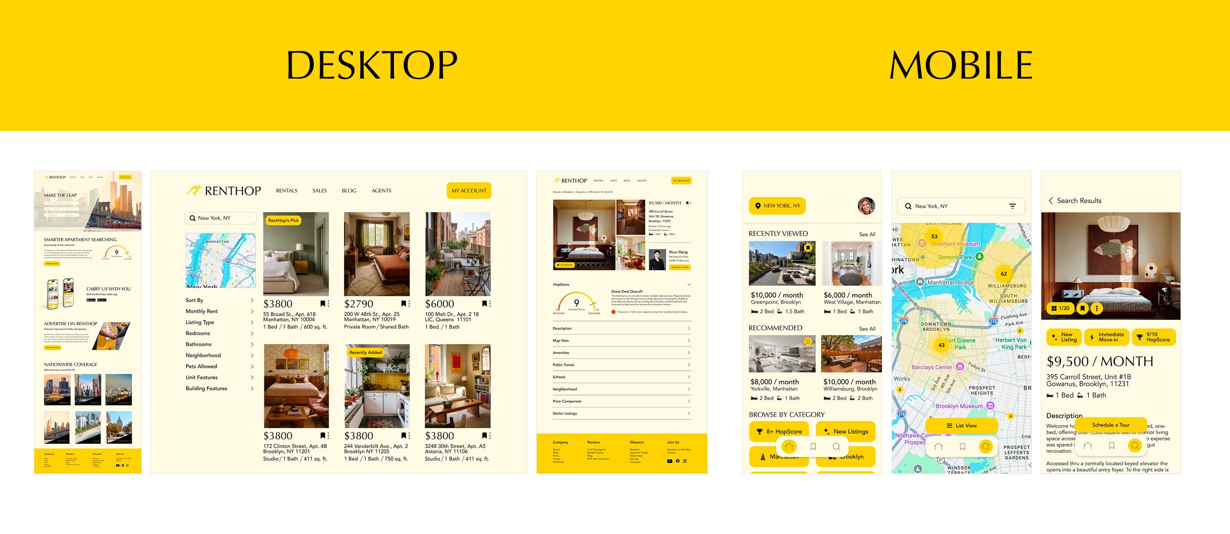
RentHop Rebranding
PROGRAM: Adobe Illustrator, Figma
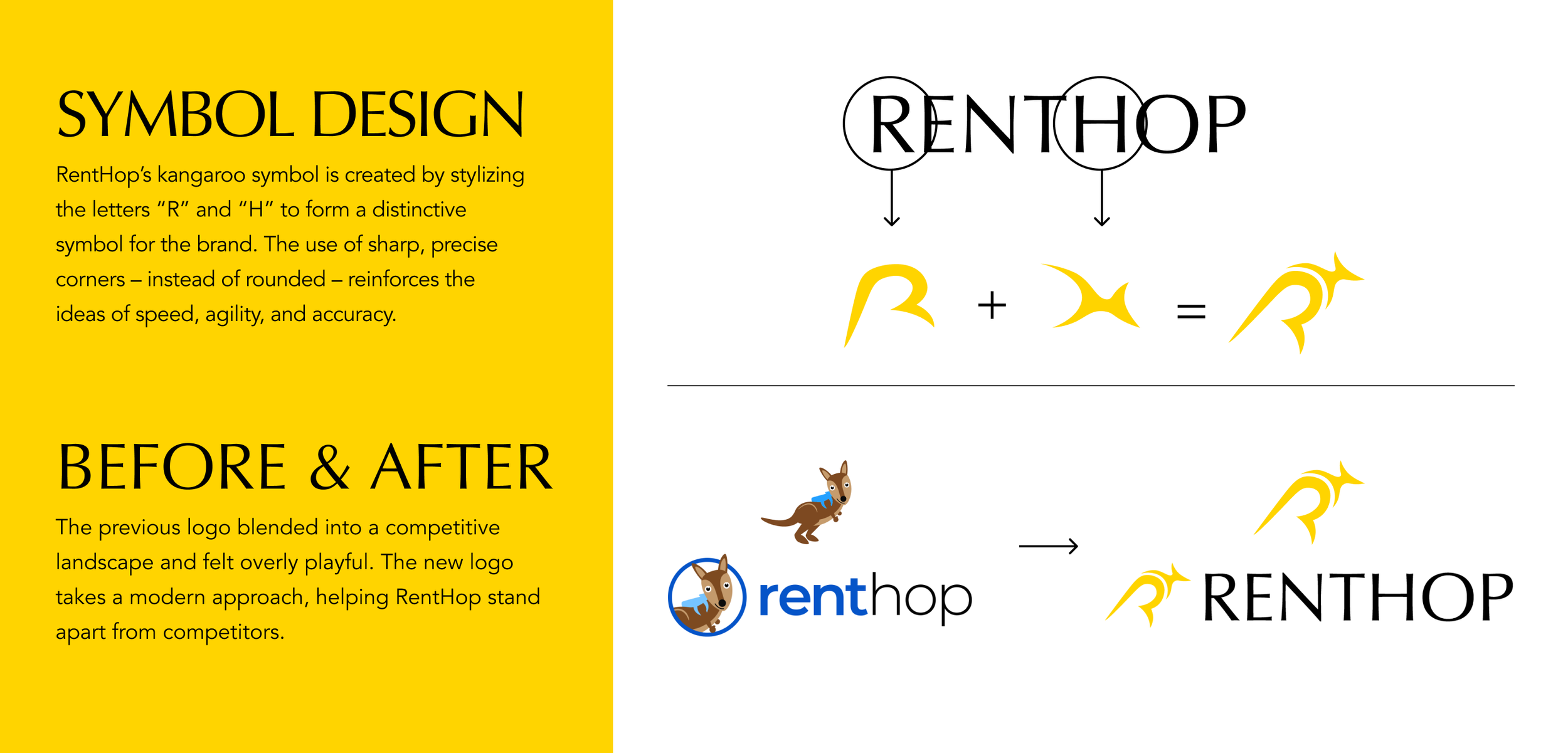
BRIEF: RentHop, an online rental marketplace, had two key priorities: establish itself as a serious competitor to Zillow, StreetEasy, Trulia, and Redfin, and rebuild trust with its audience. The brand wanted to move upmarket with a more premium, credible identity while positioning its AI capabilities as a key differentiator. At the same time, RentHop had experienced declining audience engagement and website traffic, driven in part by misconceptions about the quality of its listings and leads. Rebuilding trust with both renters and landlords was therefore essential to strengthening the brand’s position in the market.
OUTCOME: The new brand strategy gives RentHop’s original logo a modern, recognizable twist. The color yellow symbolizes achievement and speed, reinforcing RentHop’s efficiency, while the typography balances approachability with professionalism. Together, these elements helped rebuild trust, elevated RentHop’s market position, and created a more modern, distinctive identity.
*Concept Work
PROGRAM: Adobe Illustrator
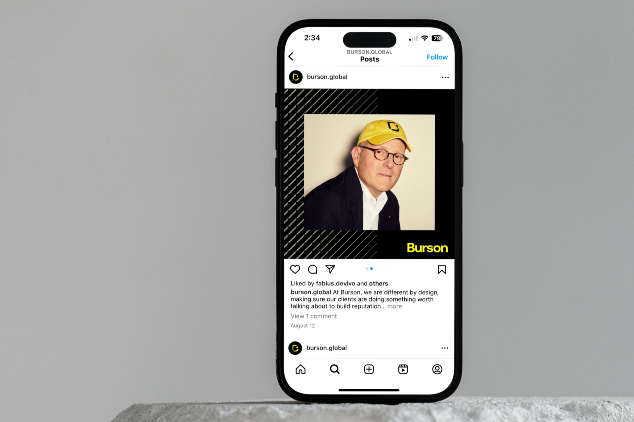
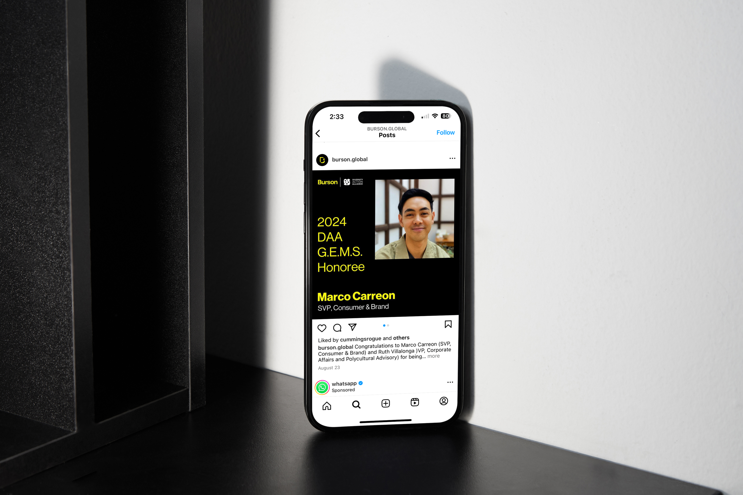
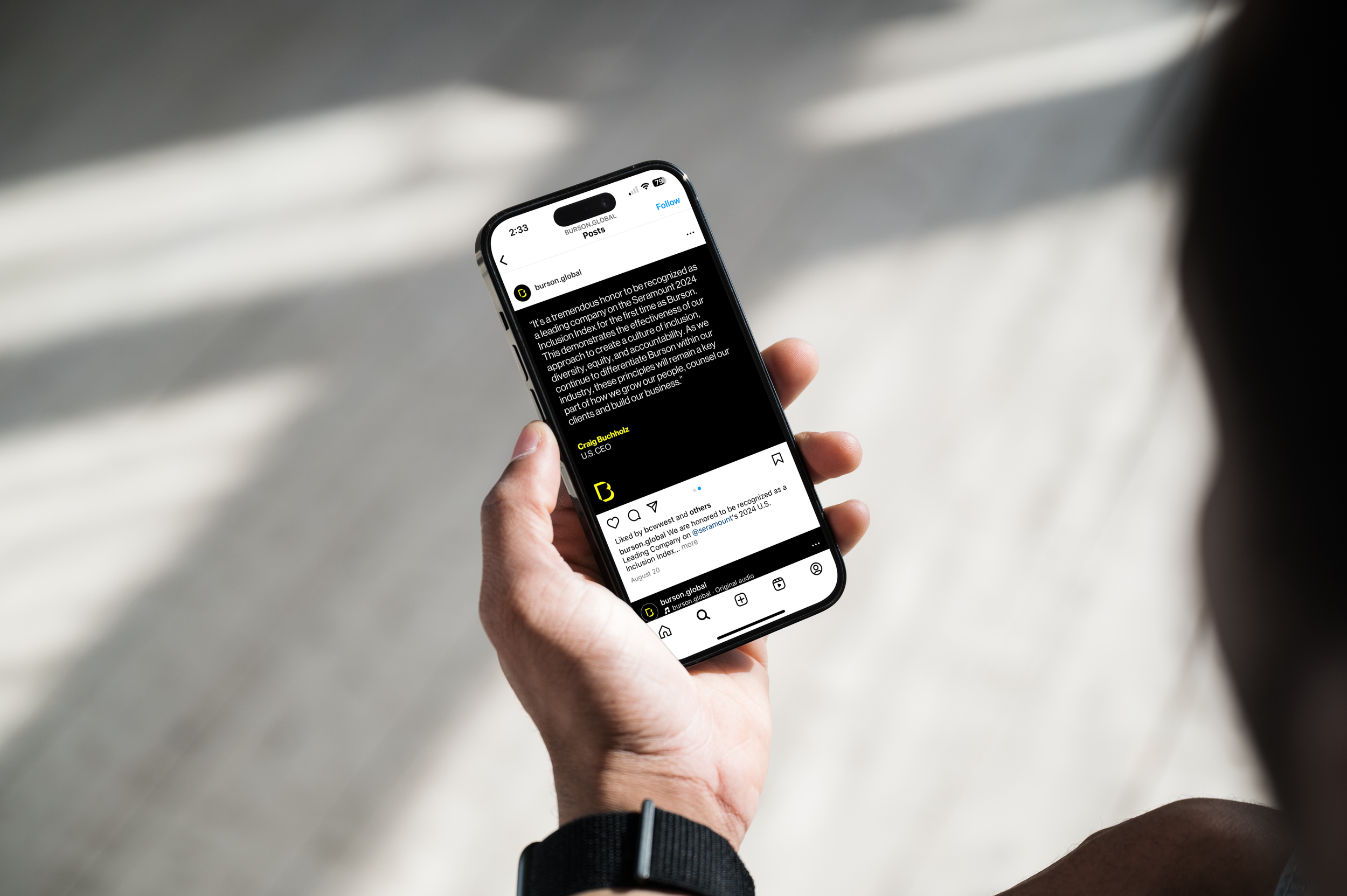
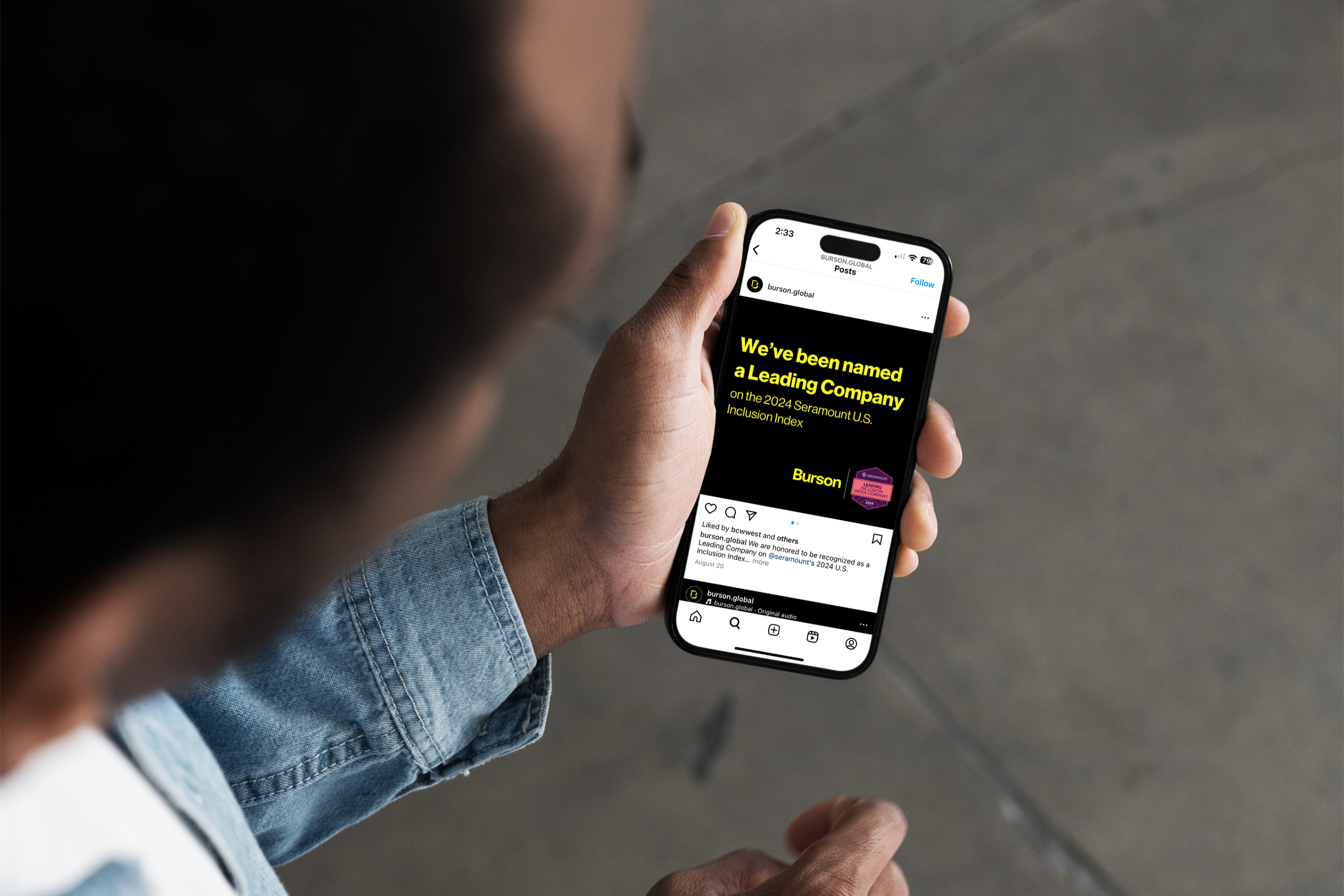
BRIEF: Following the merger of BCW Global and Hill & Knowlton to form Burson, new brand guidelines were finalized, creating a need for a cohesive suite of social media templates for new hire announcements, promotions, quote cards, and more.
OUTCOME: Burson’s growing social media presence was established and strengthened.
Burson Social Templates